Create a simple Sitefinity 'Call to action widget'

Daniel Plomp
September 9th, 2018
Introduction
One of the most frequently asked questions by people who start with Sitefinity is how to create widgets that can do simple things like selecting images or selecting internal pages. This isn't really hard to accomplish, so I'll explain in this short post how we can achieve this.
Scope
How can we create a simple Call To Action widget inside Sitefinity which will allow us to select an image, add a description and wrap it with a hyperlink to an internal Sitefinity page?
Solution
So in this example, I choose to build a simple ASP.NET UserControl which will be our 'widget'. Let's start by creating the control:
1. Create the UserControl
The first thing we need to do is to add a new ASP.NET UserControl to our Sitefinity project, inside Visual Studio.
2. Add the HTML markup
We will add the markup which will define how our call to action will be rendered on the front end.
You can of course use your own markup and style it using CSS. This is just for reference.
3. Add the properties in the code-behind
Next, we will define some properties inside the code-behind class which will hold the values for the Image, Page, and Description.
4. Bind the property values to our frontend controls
After we have these properties defined, we need some logic to actually bind these values to the frontend controls. We can do this inside the Page_Load event and call a separate method:
You see that we are using some helper methods here to get the Image and the Page objects based on the Guid properties we defined earlier.
5. Implement the ICustomWidgetVisualization interface
To make things a little more user-friendly, we can inherit from the ICustomWidgetVisualization interface, so that we can use two extra properties which help us to define a friendly message to the end-user whenever the defined properties are not set. In that case, we want to remind the end-user to set the properties using the widget designer.
So, we need to implement from this interface, which will look like this:
public partial class CallToAction : System.Web.UI.UserControl, ICustomWidgetVisualizationThis interface will force us to implement two properties, IsEmpty and EmptyLinkText.
6. Create the widget designer
Now we need to create a designer for our widget. This is just a nice way to let the user assign values to the properties on our widget. So, let's start by first building our project.
We will use Sitefinity Thunder to create the designer. This is actually the most simple method to do this. You can just add a new item inside a folder of your project. You need to choose a 'Designer for an existing widget'
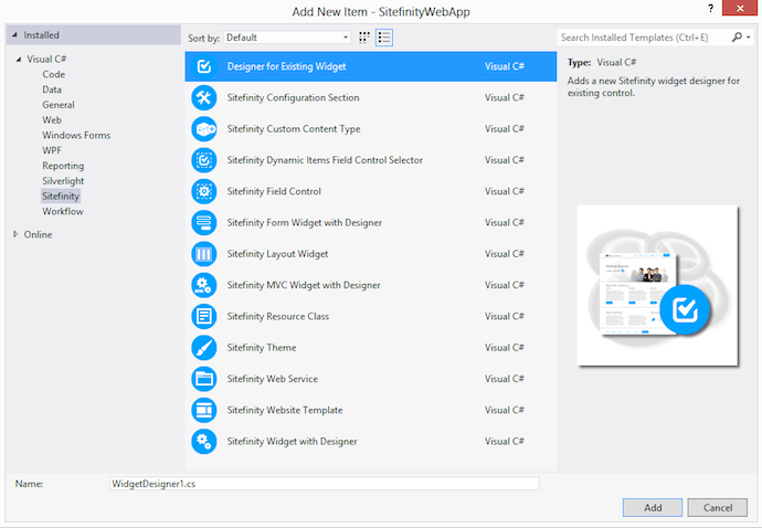
After choosing a name, the wizard will guide you through the process.
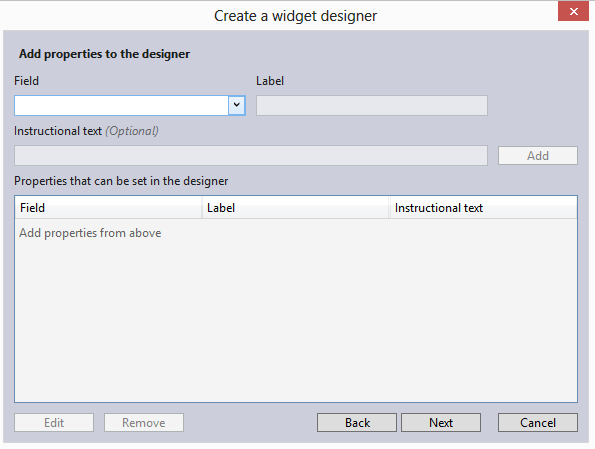
I will not go into detail about this, but it comes down to choosing the property from the list, giving it a name, and adding it to the properties list. In case you select a Guid property, you will get the option to use a PageSelector, ImageSelector, or DocumentSelector. This will insert those selectors on your designer.
7. Add your widget to the toolbox
When you are done creating the designer, we can add the widget to our toolbox. We also can use Thunder to do this, so after you have built your project, we click on the project name inside our Visual Studio solution. A blue Sitefinity Thunder icon will appear in the Solution Explorer toolbox:

Clicking this will launch another wizard that will allow you to select a widget from your project and add this to the Sitefinity Toolbox so that you can actually drag and drop the widget onto your pages.
Read more about Sitefinity Thunder and it's possibilities in the Documentation.
8. Configure your widget
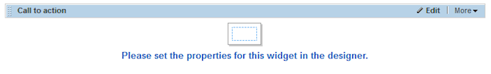
Now when we have added the widget to our Toolbox, we can actually drag it onto our page. The first thing you will see after doing this is the message we defined when no properties have been set:
We can now set the properties using the designer that Thunder created for us, by clicking on the icon or the Edit link:
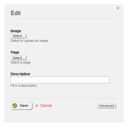
We can now choose an image, select a page, and set the description for our widget.
The end result will be something like this:

So, that's all you need! If you need the code for this example, you can review and download this from my GitHub account. If you have any questions or comments, feel free to post them here or send me an email.
